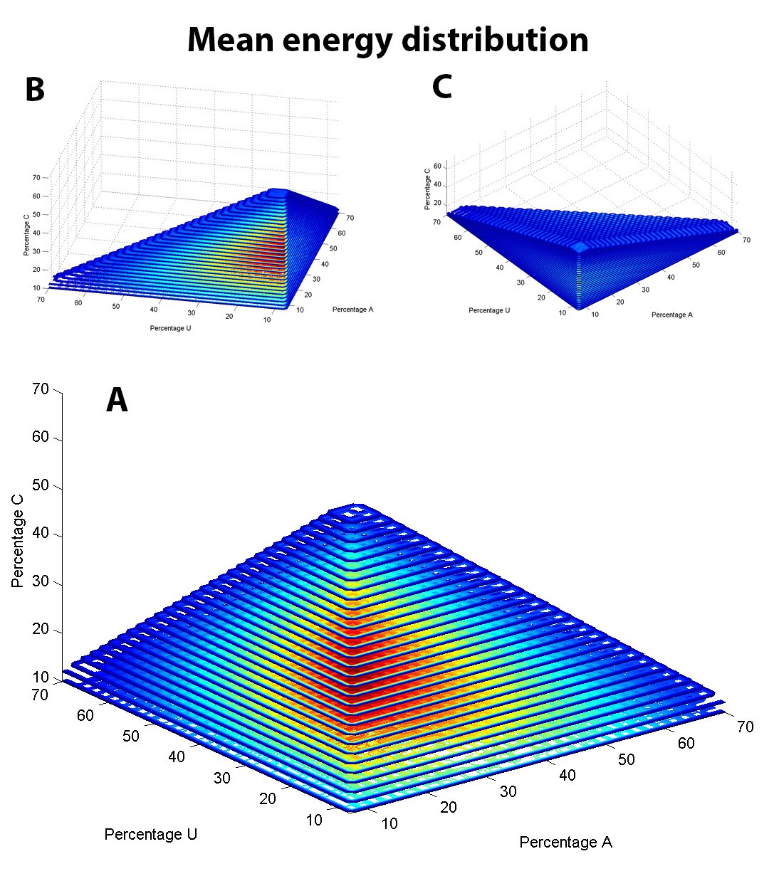
Figure 2

Mean MFE distribution of sequences 100 nt in length. (A) The mean MFE of 1000 sequences with the indicated composition is plotted in a 3D contour plot (Matlab) with the percentage of three nucleotides in the sequence specified on the three axes. The false color scale indicates a relative measure of the mean MFE: red a relatively low MFE value with a ΔG (Gibbs free energy change) ≤ −80 kcal/mol, yellow an intermediate MFE value (−80 kcal/mol < ΔG ≤ −40 kcal/mol) and blue a relatively high MFE value (ΔG > −40 kcal/mol). (B,C) The same distribution as in (A) is shown at two different angles to help interpretation and to prevent optical illusions.